Sunday, January 31, 2016

Citrus, Spices, and Glass

January 28, 2016 4"x4" on Aquabord
Palette: Juane Permanent, Carmine, Ultramarine Deep, Lemon Yellow, + W
This was a week filled with sleepy painting sessions. As a goal, I aimed to identify and focus on the major shapes and lines in each composition quickly. My apple was my quickest study yet at 20 minutes, and the other two below were great practice in painting glass. I'm hoping to have a sit-down with a glass subject sometime in the next few days to do better justice. Still, there is something appealing in the texture of these less-refined works. 

My favorite of the week was my grapefruit and lime still life, probably because I haven't been able to resist painting them on multiple occasions this month. Even though I painted it quite late on Thursday, the refreshing colors and the lime's strong citrus scent helped keep me awake until it was complete!


January 27, 2016 ~4"x4" on Watercolor Paper
Palette: Ultramarine Deep, Lemon Yellow, Burnt Sienna + W

January 29, 2016 5.5"x8.5" on Watercolor Paper
Palette: Peacock Blue, Prussian Blue, B+W
January 30, 2016 5.5"x7" on Watercolor Paper
Palette: Burnt Sienna, Ultramarine Deep, Yellow Ochre + W

Wednesday, January 27, 2016

First Experiences with Ampersand's Aquabord


January 24, 2016 4"x4" on Aquabord
Palette: Yellow Ochre, Carmine, Peacock Blue, B+W (with a touch of Flame Red in the copper)

Last week I had the wonderful experience of opening a package brimming with Ampersand boards to use. In addition to new Claybords, I also bought a couple of packs of Ampersand’s Aquabord to try out. I waited just a day so that I could have my first experiences with the Aquabord on the weekend, and the above was my first painting on the new surface.


They suggest you flush the surface with water first to release any air that might bubble to the surface while you paint (and I noticed no bubbling once I began painting). After I did that, I waited for the board to be just between damp and dry to do a light sketch of my still life and lay down the first wash of color with my gouache.


Immediately, you can tell the difference between the two surfaces. In comparison with Claybord, the Aquabord surface felt like it was helping me to even out the distribution of water. As I developed the intensity of color on different areas, the surface remained easily workable. On Claybord, I have found the paint needs to be just the right level of wet to blend properly, but that was much less noticeable with this surface.


I could see the way that the pigment and paint seeps into the board becoming an occasional problem. The copper plate in the back of this still life is a rocked mezzotint plate, and the light differed subtly across it based on the directions of the mezzotint rocker’s trail. While trying to capture the subtleties of this light, I found that my brushstrokes kept being absorbed into a beautiful, flat area. If you zoom into the top picture, you can see the brushstrokes more evident at the bottom.


Overall, I was extremely pleased with my first experience painting on Aquabord. This still life is of several important objects to me in relation to my education as a printmaker favoring intaglio processes. It includes the rocked mezzotint I keep for the next opportunity I have to use an etching press, a jar of copper shavings from plates I filed the edges of in my last semester, and a few samples of etching ink I picked up at printmaking conferences.

January 25, 2016 4"x4" on Aquabord
Palette: Carmine, Peacock Blue, Yellow Ochre, + W

My second painting on Aquabord was incredibly tricky in the beginning in every way but the surface, which was consistently lovely. First, it took me an embarrassing amount of time to settle on, an admittedly easy, composition. Usually I average around 2-3 thumbnail drawings before settling on a composition. This one had 7. Some with multiple onions, a knife, with/without a cutting board, etc. Then, once I realized it would be better to just paint the onion than to keep fussing, I had a difficult time being happy with the colors! I’ll chalk it up to a learning experience.


January 26, 2016 5.5"x8.5" on Watercolor Paper
Palette: Lemon Yellow, Ultramarine Deep, Burnt Sienna

Yesterday morning, I returned to watercolor paper for a quick hour-study of apples.

Sunday, January 24, 2016

Lemon Slice in Tea

January 23, 2016 4"x4" on Claybord
Palette: Prussian, Lemon Yellow, Chinese Orange, Permanent Yellow, B+W

Perhaps it is because I try to limit the "pretty" things I buy myself, but when I am arranging my still lifes I almost always grab a gift to include. This cast iron teacup is part of a set my brother gave my husband and I several years ago. Some day, when I have an entire day open to me to paint, I would like to do a still life of the complete set - teapot, two cups, and two dragonfly coasters.

It helps that my brother selected my favorite shade of blue, meaning these will pop up over and over again. Since the tail of the coaster tilts up, it should remain interesting to paint from several angles. 

This little painting marks the first claybord that worked with me every step along the way! The medium was extremely forgiving of my mistakes last night, including needing to correct two spots when at the very end droplets of water fell from my paintbrush onto my cup.... ahh! 

Saturday, January 23, 2016

Short Time, Practice Time

The last two nights I noticed that my patience was running a little thin. The desire to paint was there, but the desire to spend 4-6 hours completing a finished painting was not. I wanted to wrap up my work day, drink a glass of wine and play scrabble with my husband! So, I decided to narrow my focus to two areas that have been causing me trouble:


January 21, 2016 5.5"x8.5" on Watercolor Paper
Palette: Black & White
1. Values. I may have mentioned this in an earlier post, but I have always loved paying close attention to subtle value shifts. Translating that from my drawings and oil paintings into gouache has been the most (second most?) difficult thing about the medium. I've found I have far greater success in the application and mixing of color than in shifting values with one color. To practice with this, I decided to do a rendering of an egg. I will definitely need more practice to get things up to par, but this black and white study was a way to start working on the problem without eating my time.

January 22, 2016 6"x8" on Watercolor Paper
Palette: Black & White
2. Speed & Brush Size. Over the last week of painting, I've noticed that I've introduced some of the difficulties I have in oil painting to my gouache studies. In particular, my tendency to waste time by using very small brushes. Since I wanted to wrap up quickly, I decided to limit myself to primarily using one size brush for the study and to complete it within the hour. 

I think in the future when I am wanting to limit my time for the day painting I will return to these two types of studies. It will be good to break up the time I usually spend on setting up a still life and selecting a palette, getting right to the bone of what I need to work on.

Today I feel my enthusiasm is refreshed! Also, a new package filled with Claybord and Aquabord panels has just arrived, so I am off to play paint!

Thursday, January 21, 2016

Oranges in a Swirl


January 20, 2016 6"x8" on Claybord
Palette: Yellow Orange Permanent, Yellow Permanent, Flame Red, Prussian, B+W
Last night while I was painting, I became a tad hypnotized with the dish I was using for my still life, can you tell? The glaze on the plate is full of speckles and directional dripping, wonderful to paint! I’ve included some quick-snap progress pics of the painting throughout the night below.


Wednesday, January 20, 2016

Unbaked Brownies & Lemon Ginger Tea

January 16, 2016 6"x8" on Watercolor Paper
Palette: Carmine, Ultramarine Blue, Raw Umber, B+W
This is probably my favorite painting from the past few days. The last few Christmases my brother's girlfriend has gifted us with a set of homemade mixed jar goodies - cookies, hot cocoa, dirty rice, etc. They are always one of my favorite gifts and I try to spread them out over time. The one I chose to paint was a brownie mix in a beautiful purple glass jar (which will need to be painted with yellow flowers in the future). The very next night my husband whipped up the brownies while I was painting as a surprise, and they tasted just as good as they looked! 

January 17, 2016 4"x4" on Claybord
Palette:Juane Brilliant, Burnt Sienna, Ultramarine Blue, Yellow Ochre, B+W

January 18, 2016 6"x8" on Watercolor Paper
Palette: Juane Brilliant, Lemon Yellow, Peacock Blue, Chinese Orange, B+W

The next two days were a challenge and I was in a bit of a tiff with my paints. It is one thing to see the subtle values on an egg, but an entirely different one to create them with gouache and my brush kept picking up pigment from the claybord rather than setting it down. 

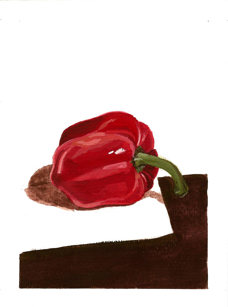
January 18th began with another painting on claybord and a composition I have been really excited to try out. However, the paint was not working with me and the night was growing late. Eventually, I realized that I want to give this still life a strong effort was not going to accomplish that while drowsy. I grabbed some produce from the kitchen and whipped this up instead to keep to my painting-a-day schedule!

January 19, 2016 6"x8" on Watercolor Paper
Palette: Lemon Yellow, Prussian Blue, Chinese Orange, B+W
Yesterday's painting will need a better photograph later on, the details of the lemon don't come across quite right from the scan even with a bit of editing. Though the lemon wedges have a similar texture to the grapefruits I've been painting, the values and little color shifts are much more subtle and needed a different approach. The shadows of the lemon are a bit more purple than the green they appear in the scan above, but the rest of the colors are pretty accurate.

Yellow and blue are my favorite color pairings, and I hope to use this palette again soon. You might even see this little dragonfly teacup paired with lemons again! While ultramarine blue mixes well with just about every color I've tried, I really love prussian blue and get the feeling I'll return to it more and more often.

Saturday, January 16, 2016

A Yellow Chair You've Probably Owned


January 15, 2016 4"x4" on Claybord
Palette:Yellow Ochre, Ultramarine Blue, Burnt Sienna, a pinch of Permanent Yellow, + W
As I referenced in my initial post, I am hoping that painting daily and quickly will let me “loosen” up my painting process. This is for multiple reasons, one of which is that I am one of the artists “guilty” of drawing with paint. I am not sure if anyone has criticized me directly for it, but I am aware that my process of drawing and painting are not entirely distinct from one another.


Overall, I haven’t thought of it as too big of a problem. I love drawing! I will always love drawing. Painting, to me, is the opportunity to introduce color into my artwork. The problem comes when I use this as an excuse to take too long making each part perfect at every step along the way. Painting with gouache has made me address this fear on several occasions, particularly since I’ve trying claybord this last week. I get one or two layers into my painting and think, “This is terrible. The proportions have warped, the paint is uneven, there is no way that this will turn out at all okay!.”


But the goal of the project is to create a finished piece, even if it is a terrible piece, so I keep painting until it reaches an overall complete feeling. So far I’ve yet to think of one the paintings unredeemable when I’m done.  The problems have worked themselves, mostly, out and I feel as though I really painted it.

The chair above is one I’ve owned since high school, bought at a thrift store, is getting pretty worn down with age and love from my pets. Since I’ve had it, I have heard many people say that they or their great aunt had one just like it and a couple provide photographic evidence from decades ago! Now it is a studio chair for visitors, but let’s be honest - mainly for my pup and cats.


January 14, 2016 4"x4" on Watercolor Paper
Palette: Peacock Blue, Emerald Green, Prussion, Raw Umber, B+W

Thursday, January 14, 2016

First Experiences with Ampersand Claybord

When using oil paint, I prefer to paint on panel. My friend Candice Eira Hoffman Cramer, who is an amazing artist, taught me how to build birch panels when we were in college together and it has remained my favorite surface. Using gouache on paper has been great, but I adore the sturdy feel of painting on panel. You don’t have to worry about warping or taping down the paper to realize later you didn’t get quite a right angle. In researching using gouache on non-paper surfaces, I found Ampersand’s Claybord and new I had to give it a whirl.

January 11, 2016  4"x6" on Watercolor Paper
Palette: Ultramarine Blue, Burnt Sienna + W
My order for Claybord came in on Tuesday, when I had my second still life of a mochapot set up and I almost skipped a meeting for work so that I could paint right away!


January 12, 2016 4"x4" on Claybord
Palette:Ultramarine Blue, Burnt Sienna, Peacock Blue, B+W
The experience of painting on Claybord is different from paper in a few ways. Claybord is an absorbent surface, but absorbs in a different manner to paper. While painting gouache on paper makes it easy to create a flat color washes, painting on Claybord shows each brushstroke much more clearly. The inside of the brushstroke seeps into the surface, while the edges remain raised.

Another difference is the way that the gouache reacts to additional layers. On paper, it is fairly easy to control how the color I am laying down mixes with the color on the sheet. On Claybord, trying the same technique kept causing me to pick up sections of the paint. It reminds me of when you are using a dry erase marker and trying to fill in a space only to keep erasing sections instead.

January 13, 2016 4"x4" on Claybord
Palette: Juane Brilliant No. 2, Carmine, Peacock Blue, Permanent Yellow, B+W
Nonetheless, the surface of the Claybord is beautiful and finding out how to paint on them feels like a delightful compulsion. I purchased a four pack of 4”x4”s and a three pack of 6”x8”s and plan to use them before I decide how I feel about continuing to use them long term. I also plan to try out Ampersand’s Aquabord to see how it compares.

Monday, January 11, 2016

Four Days of Citrus

I’m hoping this blog can be a reference point for me in the future to see the color combinations, but I was not expecting getting true-to-lfe photos to be so difficult! The colors are as close as I could swing it through the scan and color correction in photoshop, but I am not yet a whiz with technology. I bought a new phone with a fair camera last week, so I’m hoping that with regular practice my photography and editing will become better. For now, scanning still seems to work best (I’ll share one comparison below), even though it washes out the lighter hues.

These are the papers and gouache I have been using so far:


The gouache I have really loved. The Holbein 18 set can be bought on Dickblick here for $62 but I lucked out and found it on Amazon for around $35 in December. The watercolor paper I bought from my city’s Hobby Lobby, thinking of using it just to experiment, and it has been… not great. The 8”x8” pad has held up pretty good, but the smaller sizes of the same paper pill easily and have a less pleasant texture. I will be upgrading to a better paper next time, and I have a few of Ampersand's clayboards on their way to try out!

As a note of warning, when I needed to restock my white the only gouache my local Hobby Lobby carried was Plakkaatverf Designer Gouache. Maybe it works well for other uses, but for me it has mixed terribly with my other paints, and has a watery, sticky texture. I’ll be sticking with Holbein for now.

My last four paintings have all had a citrus focus. My groceries included a bag of grapefruits last week and I have loved the bright, juicy colors!

January 7, 2016 (AM) 8x8"
Palette: Juane Brilliant No. 2, Flame Red, Prussian Blue + W

January 8, 2016 (AM), 4"x6"
Palette: Juane Brilliant No. 2, Flame Red, Terre Verte, Permanent Yellow, B+W

January 9, 2016 (AM), 4"x6" (PHOTO)
Palette: Juane Brilliant No. 2, Flame Red, Terre Verte, Permanent Yellow Orange, B+W


January 9, 2016 (AM), 4"x6" (SCAN)
Palette: Juane Brilliant No. 2, Flame Red, Terre Verte, Permanent Yellow Orange, B+W

January 10, 2016 (AM), 6"x8"
Palette: Juane Brilliant No. 2, Carmine, Yellow Ochre, Permanent Green Deep, B+W

Wednesday, January 6, 2016

Week 1 (Almost)


With nearly one week complete of daily painting, I wanted to get some pictures up! I'm still working out a few kinks in getting the images to look just right. I haven't been able to get steady pictures outside yet, so I have been using my scanner. This washes out some of the light tones and removes some of the texture, but gets most of the job done.

I'm denoting between AM/PM on the paintings to give an idea of the time spent daily on painting. In the morning I have sixty to ninety minutes to set aside for painting before getting ready for the day, but in the evening I am able to set aside 3 - 5 hours per painting. 


January 1, 2016 (PM), 8"x8"
Palette: Prussian Blue, Chinese Red, Raw Umber, B+W
January 2, 2016 (AM), 6"x8"
Palette: Peacock Blue, Ultramarine Blue, B+W
January 3, 2016 (PM), 6"x8"
Palette: Peacock Blue, Chinese Red, Permanent Yellow, B+W
January 4, 2016 (PM), 8"x6"
Palette: Ultramarine Blue, Burnt Sienna, Yellow Ochre, B+W
January 5, 2016 (AM), 8"x6"
Palette: Carmine, Yellow Ochre, Terre Verte, B+W
January 6, 2016 (AM), 6"x8"
Palette: Peacock Blue, Raw Umber, B+W

In my next post I plan to share which paints and papers I have been using so far. Right now I am getting ready to go to a figure drawing session so my blogging time has been cut short! 


Tuesday, January 5, 2016

The Beginning Post!

Hello! My name is Liz Coffey, and you can see some of my past artwork here: www.lizcoffeyart.com (I’ll be updating this website soon).

While my artwork over the last few years has been largely of symbolic abstractions, I plan to spend 2016 looking outward again at real things! I will be painting still lifes and en plein air with the goal of loosening myself up and reminding myself how to look again.

For a while, these artworks will be painted primarily in gouache, with a single painting created every day. I purchased my first set of gouache paints in mid-December and have been having a great time exploring this new medium! Here are a couple of my paintings from December:

My first gouache painting - used just about every color!


In case there are any other newcomers to gouache visiting my blog, I’ll be sharing some of the nuts-and-bolts of the color palettes and different surfaces I’ll be using along the way.  I probably won't be able to help but have a post about my favorite podcasts, too. 

Please feel free to share with me any suggestions for artists to look at, materials to use, or podcasts to listen to!